Content Blocks Guide
Creating Interactive Buttons
Buttons are essential for guiding your users, directing them to external resources, or enabling them to take specific actions outside of the form submission. The Button block in LumoPages allows you to create clear, customizable, and clickable calls to action, seamlessly integrating with your Lumo's design.
This guide will show you how to add and configure interactive buttons.
What is a Button Block?
A Button block is a versatile Content Block that displays a clickable button. You can customize its text, size, alignment, and most importantly, define where it leads the user when clicked (a URL).
Step-by-Step: Adding a Button Block
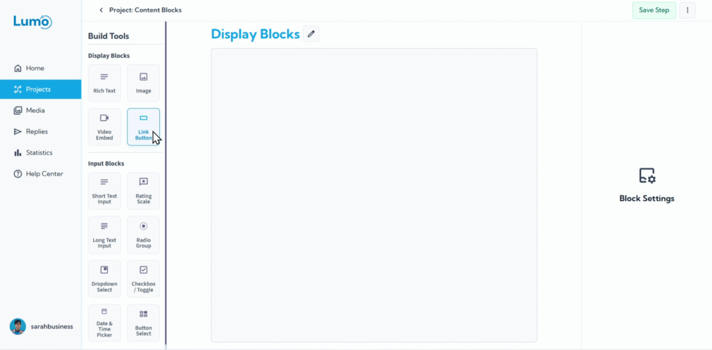
- Enter the Stage Editor: Navigate to the specific stage where you want to add a button.
- Add "Button" block: Drag the "Button" block from the panel that appears, select the "Button" block type under "Content Blocks."
Configure Your Button: Once the Button block appears on your stage, you'll immediately want to customize its key properties.
Button Text (Custom Text): This is the text displayed on the button itself. Make it clear and action-oriented.
- Locate the "Button Text" or "Custom Text" field in the block's settings.
Link Destination (URL): This is the web address (URL) where the user will be directed when they click the button.
- Locate the "Link URL" or "Destination URL" field.
- Paste the full URL (e.g.,
https://www.sarahspatisserie.com/shop).
Ensure you include https:// at the beginning of your URL for proper linking.
Customizing Your Button's Appearance and Layout
Beyond its core function, you can fine-tune the button's visual presentation:
- Button Size: Adjust the size of the button to give it more or less prominence on the page. Options might include Small, Medium, Large, or custom width settings.
Button Alignment: Control where the button appears horizontally on the stage.
- Left Alignment: Places the button on the left side.
- Center Alignment: Centers the button, often ideal for calls to action.
- Right Alignment: Places the button on the right side.
- Text Alignment within Button: Some platforms also allow you to align the text inside the button (e.g., left, center, right). This might be a subtle but impactful design choice.
Saving Your Changes
As with all changes in the LumoPages editor, remember to manually save your modifications to button blocks. Click the prominent "Save" button in the editor.
If you attempt to leave the editor without saving after making changes, LumoPages will remind you to save your work. This is crucial to ensure your interactive buttons are live and function as intended for your users.
Interactive buttons are powerful tools for guiding your users and extending the functionality of your Lumo beyond just collecting data. Use them strategically to enhance user flow and connect your Lumo to your broader online presence. Next, we'll briefly touch upon the upcoming Gallery block.