Data Collection and Management
Lumo Statistics Page
This new feature transforms your raw response data into clear, actionable visual insights, helping you understand your audience and the performance of your forms at a glance.
This guide provides a quick overview of how to access and utilize the new statistics page.
Why Use the Statistics Page?
- Visual Clarity: Quickly interpret your form responses through engaging and easy-to-read charts.
- Data-Driven Decisions: Identify trends, popular choices, and key feedback points instantly.
- Project-Specific Focus: Dive deep into the performance metrics of any single Lumo project.
Accessing Your Project Statistics
The statistics page is designed to give you laser focus on the performance of individual projects.
Navigate to the Statistics Section: Find and click on the "Statistics" link or icon in your Lumo platform navigation.
Once a project is selected, the page will dynamically populate with charts representing the aggregated responses for that project.
Visualizing Your Responses
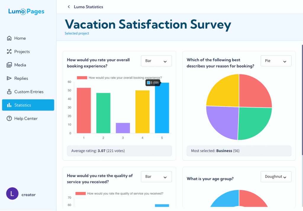
Your project responses are now visualized in a selection of dynamic chart types, focusing on the data collected in your form fields.
Chart Types: You have the flexibility to view your data in different formats to best suit your analysis needs:
- Bar Chart: Excellent for comparing different response categories or volumes.
- Pie Chart: Ideal for showing the proportion of each response relative to the total.
- Doughnut Chart: A variation of the pie chart, offering a clear visual representation of proportional data.
Switching Views: You can easily switch between the Bar, Pie, and Doughnut charts to examine the same data from different visual perspectives.
By simply selecting your project and navigating the chart options, you gain immediate, powerful insights into how your users are engaging with your Lumo pages.